REFINITIV
Search All
1 Year
Refinitiv (now LSEG) are a data and analytics company provide real-time news and data serving users in the millions. Previously owned by Thomson Reuters before separating to become it’s own brand, the platform serves as an integral tool to the workflow of many individuals across various verticals.
Current issues
Refinitiv Workspace processes very large amounts of data on a daily basis. It’s known for it’s market-leading financial data provision, serving users with high-quality news, insights and information.
Built without UX in mind
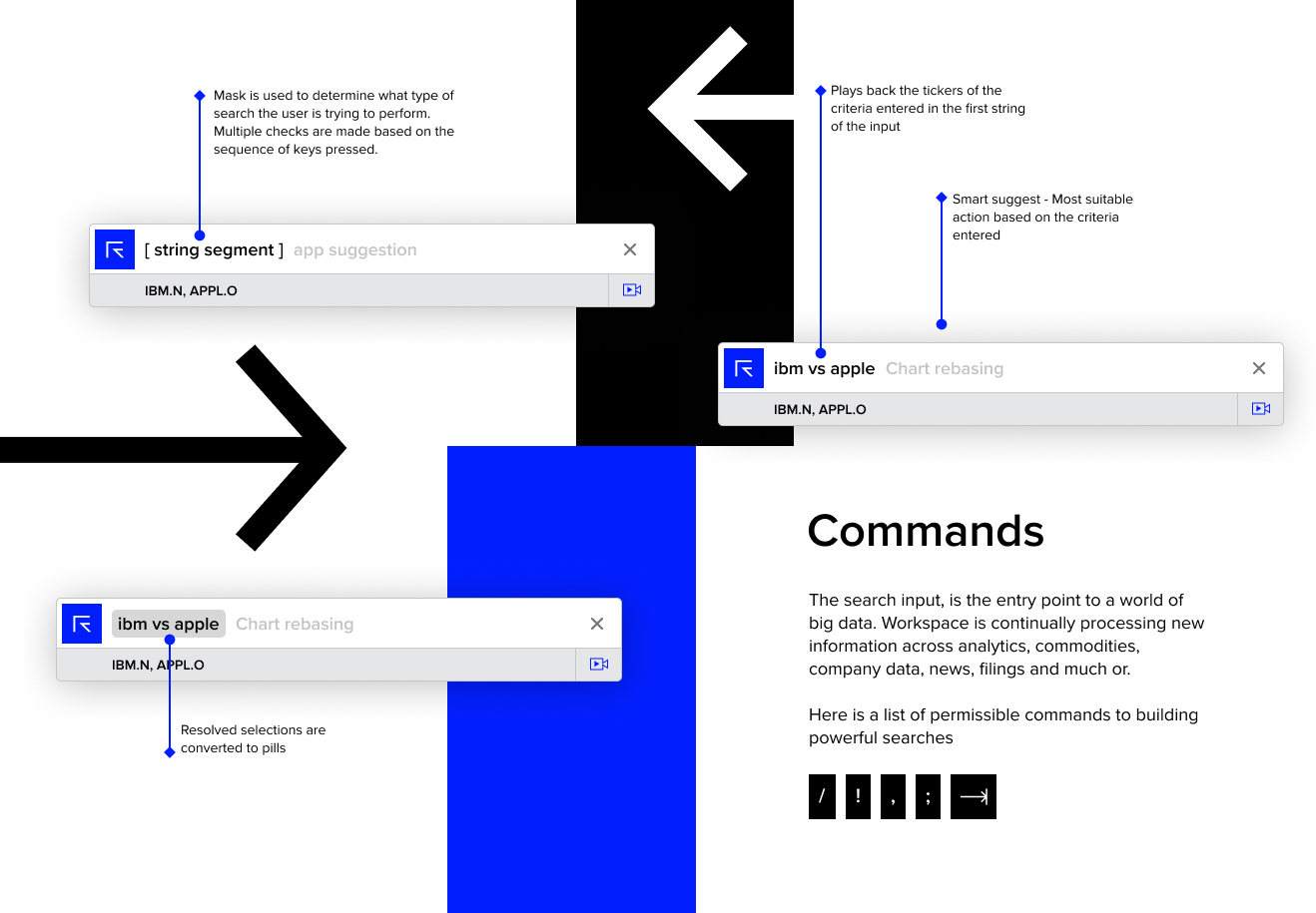
Search All was a born of developers who had no experience in product design and were tasked with building a search function with cutting-edge technology. As expected, that’s what they’ve built. The complex code required to build something on this scale alone is noteworthy. However, the demand for a revamp was created and thus, the opportunity to present content in a uniformed and accessible manner.
The tech already existed, this task was about leveraging it’s full capabilities and delivering a new experience.
Understanding user behaviour
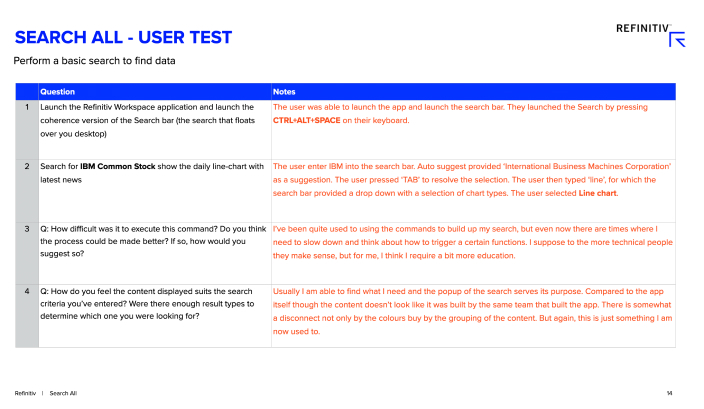
I conducted user tests in effort to get an understanding of how users were able to find data and how useful they found the results surfaced.
The requirement here was that the participants knew a basic set of commands to execute a search with multiple parameters. I interviewed 10 people and observed them as they undertook the task requested.
The key takeaways from the interviews were:
- The majority of the users didn’t always recognise what they were looking because it the content was lacking structure
- Even though they were able to perform searches in general, they didn’t feel they were able to utilise the full power of the search, not because they didn’t need to, but because they didn’t know how
Discovery Workshop
Before getting to the design, the team and I had to scope out the requirements and outcomes for the project. Although it was a redesign of the previews, we really wanted to ensure that we covered all scenarios that could be played out by the search process.
We were able to leverage the knowledge of the product owner on out team who had in-depth experience of building strings capable of executing the most complex of searches.
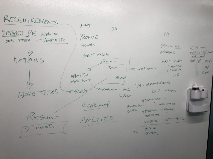
The session included a break down of the considerations ie tech, the data available for viewing etc, and also a look a what potential next phases could look like.
This was not your traditional UX delivery. Data played a very large part of this process and heavily influenced the UX output.
What I brought to the team
Design documentation
Design files or any form of design documentation did not exist. There were specs from a development standpoint, but for a designer looking at Search All for the first time, this provided no value in understanding the fundamentals. I suggested creating visual guides that could be used as documentation and help a great deal with onboarding new designers.
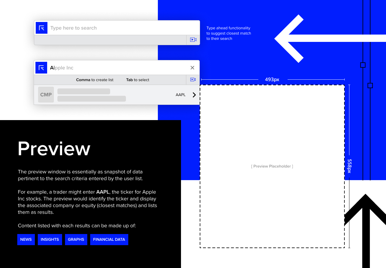
Existing preview analysis
Search All has long served Refinitiv Workspace as one of the most used functions. The idea of potentially disrupting or negatively impacting user workflows because an already working product needs face list, was not one that’s taken lightly. I really needed to ensure that all bases were being covered as it would seem that we’d only have one chance to get this right for users.
I took a deeper look at the previews across various apps. These include previews of the real-time financial data sets such as spot rates, equities, bonds, IPO’s, and other asset types as well as news. The purpose of this was to understand the current structure of the previews, so I could begin the process of aligning them as originally planned.
Outcomes
The approach I took towards the final UX for the previews charts and data formation was simple. No bells or whistles, but simply clean-cut and straight to the point.
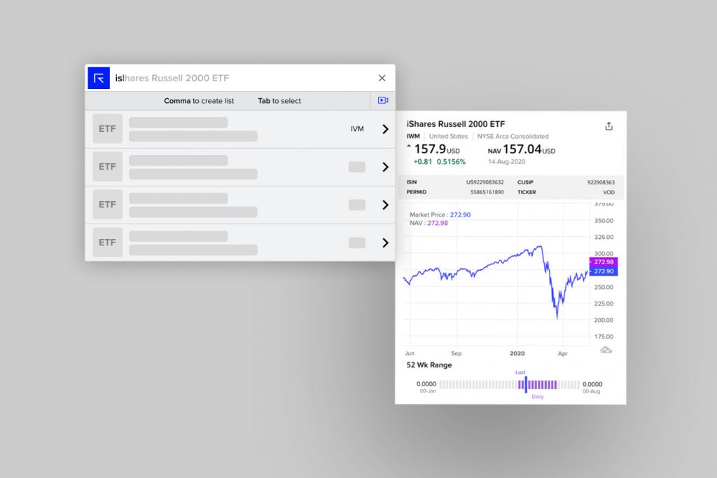
An example can be seen below after having discussed with the product lead of ETF funds on how they wanted their data to be seen and understanding from the viewport of a professional that makes use of the data.
Some key implementations:
- Line-graph to output the spot price action of the fund
- LED bar depicting the price action across a 52-week range
- The addition of the net and percentage change derivatives, with positive and negative colouring for the change direction
- Provided the fund title and meta data tags for improved ranking
- A grid-based layout
- Delivery of the visuals close to mobile size screens so previews retain a uniformed look regardless of where they are being viewed
- Content grouping and separation